At Manter, we’re continuously working to improve our software. We aim to offer the best possible experience to customers, operators, dealers and our own technicians and engineers. Because every user has different needs, multiple levels are often required, each undergoing its own development.
Focus on visualization
Until now, the focus has been primarily on the practical application of the software, which meant that visual appeal was less of a priority. To improve this, Tom, whose daily work includes design and overseeing the Manter corporate identity, was enlisted. In collaboration with the Electrical Engineering department, various visual adjustments were implemented for both the weighers and the packagers.
Improvements
A key goal was to align the look and feel of both HMIs and align them with the corporate identity, without compromising functionality. Colors are harmonized, buttons are given the same shape, and the alignment of elements is more spacious and minimalist. New icons have also been developed with a uniform and contemporary style.
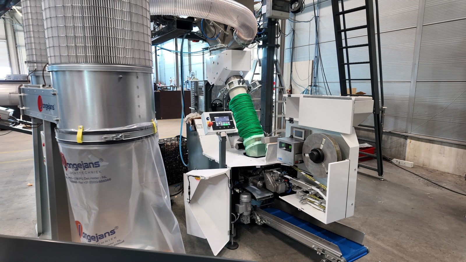
Organic rollout
The first packaging machines have now been delivered with the updated visual appearance, as shown in the video above. The updated weigher design will be rolled out to new machines in the next software update.